Contrast paints. Remember all the fuss this time last year? Some had come to the conclusion that they would be the ‘liquid talent’ many of us had been waiting for, and some of the results people initially had were promising. For many, though, the results weren’t the ‘slap on for instant results’ treatment they’d hoped them to be; really it takes some skill and practice to make the most out of them with 28mm or 32mm minis. It’s pretty easy to get a blotchy finish using contrast paints if you’re overly eager.
The paints didn’t fit my needs for those larger scales. I was working (suffering) on 28mm minis that had camouflage schemes, like Fallschirmjager, and we’re still technologically quite the distance away from camouflage paint. Contrast paints also tend to be quite vibrant and primary, which isn’t quite as useful in historicals when you’re trying to really nail that shade of feldgrau.
As my 28mm projects started to come to an end I found myself preferring smaller scales more and more. Scale models aside, pretty much everything I’ve painted this year has been 15mm or smaller. A lot of the time with smaller scales, especially with vehicles, much of your painting work is about making certain colours bolder than normal and letting the washes do the work for you. If you could combine the two, you’d have a ‘slap on and get instant results’ kind of method…
See where I’m going? 6mm+contrast paints=instant results?
I don’t normally write about painting methods as I’m not a particularly skilled painter due to my dyspraxia. However, I do enjoy it more than building minis, and when I’m trying something a little more experimental like this I think it’s worth sharing the results.
My first foray into this was with some soviet tanks and vehicles, and after referring to some colour charts online I found ‘Militarum Green’ to be a good match for what I wanted to achieve. Having slathered a coat of contrast paint onto the primed minis I left it to dry, and was pretty pleased with the initial results:
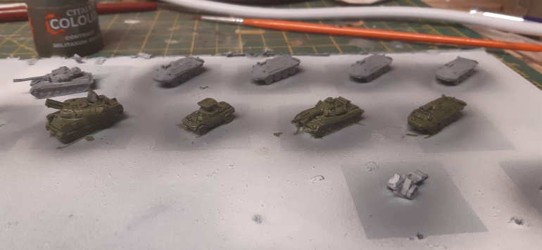
The biggest variable when working with contrast paints at this scale has proven to be the base coat. My first attempts used a white primer, but this gave a colour that seemed too gaudy and bright for Soviet paint schemes – more of an olive green than the dull green of cold war Soviet armour. Sticking a grey coat on instead gave much better results. Once this had dried I could paint details like tracks and drybrush the whole thing, and all of a sudden they were done!

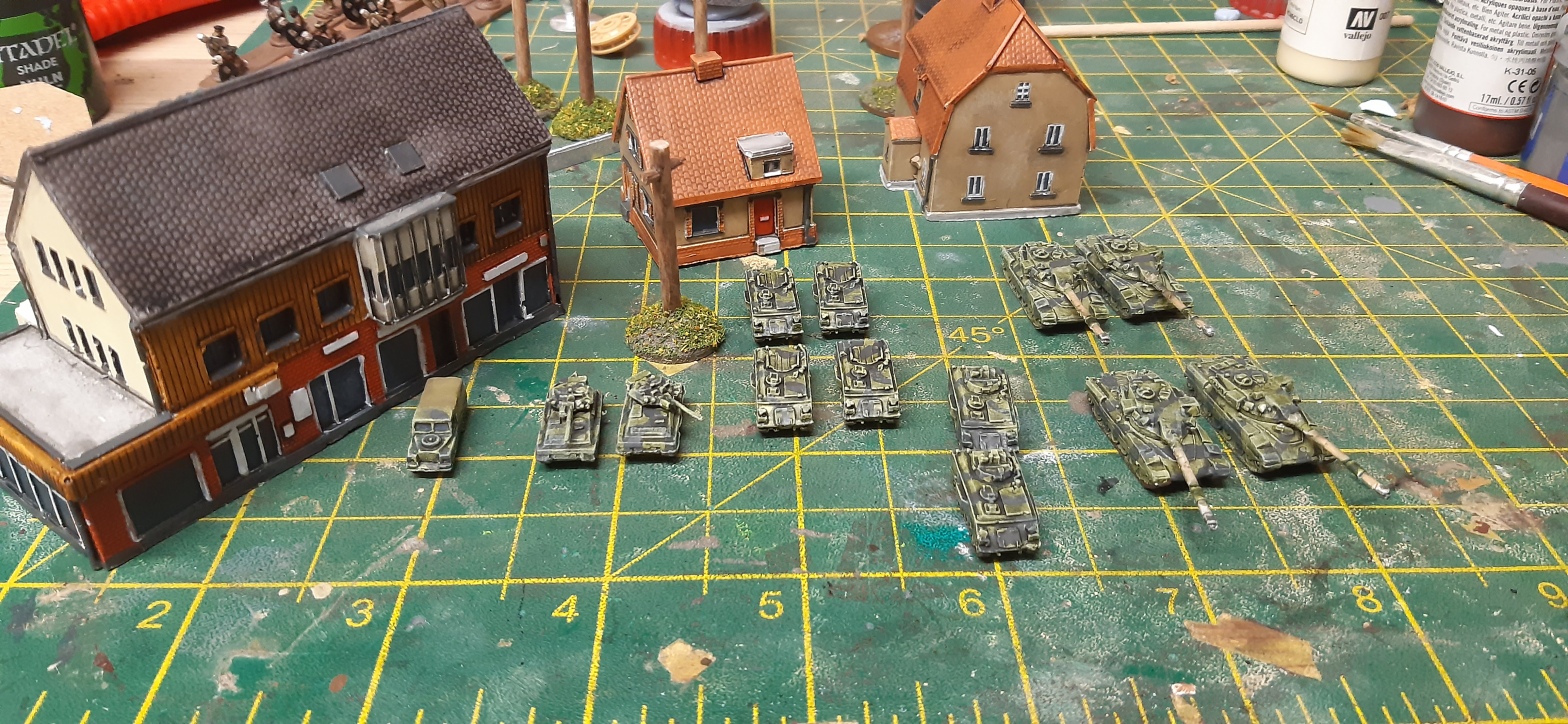
Happy to call that a success, and looking to try it further, it was time to have a go at some British Cold War tanks to face the Soviets. The white primer had looked wrong on the Soviet vehicles, but looking at reference photos made me realise it was a perfect fit for British vehicles, especially as they have a camo scheme that would require a wash that would bring the tone down a bit anyway.

I found myself liking these vehicles even more than the Soviet tanks. The results were nearly instant, and I could churn these out at a shocking pace – I’d painted 13 vehicles entirely, and to a standard I was very happy with, in the space of a morning.

One morning’s work, along with some German buildings I’d been working on
Contrast paints clearly had tremendous value when painting vehicles: what about infantry? I had Soviet motor rifle infantry ready to be painted, and while not entirely accurate, was going to paint their uniforms brown to make them easy to distinguish. Referring to colour charts led me to try the ‘Snakebite Leather’ colour, which I coated a gathering of commies in. The challenge with infantry proved to be making certain features like skin and helmets ‘pop’, which meant avoiding using any kinds of washes. The effect looks a bit unwieldy close-up, but works well on the tabletop.

The British infantry are yet to be painted, but based on my work up to now the best colour combo to represent DPM is probably going to be a grey base with the Militarum Green, in the same vein as the Soviet tanks.
In the meantime I decided to really push things as far as they could go with this, and try 3mm minis! I have a little box of 3mm Napoleonics I’m planning to use to build some forces for Blucher, and sure enough the ‘Ultramarine Blue’ contrast paint over a white primer does a bloody brilliant job for Napoleonic French!


A unit, based and painted! I’d say the detail work on this probably took me 60-90 minutes
So that’s where I’m up to with contrast paints and small scales. It’s been a resounding success for me and greatly sped up the time I need paint these little minis to a standard I’m happy with. It’s not suitable for everything – most of my ww2 minis in 6mm wouldn’t benefit from this approach, as the Germans have too many colours in their uniforms for example – but in the cases when it is appropriate it does a really good job, really quickly. As I’ve got Napoleonic Austrians and Bavarians to paint I’ll attempt to use contrast paints on those, and if there’s interest I’ll share the results on here. Maybe there’s such a thing as ‘liquid talent’ afterall.

I really enjoyed you 3mm Nappy paint description. Can you post more? I’m going to by some 3mm Nappy’s for a small battle just to get one done before I die! (not going to die soon, but I’ve put off this Montmirail project for 20 years!). I’m very interested in where you went with the contrast paints on other nationalities and especially cavalry.
Thanks for any reply!
Mike Hammond
LikeLike
Regarding the 6mm Soviets I wonder if you might solve the dilemma of losing depth when you apply detail colours by applying contrast paints to the detailed areas. For example a light brown contrast paint (Gulliman Flesh) over the flesh and grey or black contrast over gun metal or silver.
LikeLike